Friday, 19 December 2014
Tuesday, 16 December 2014
Creating the Website
I have rearranged the home page adding in the album cover image. Also I have changed the navigation bar along the top to make it more visible for the users.


Editing the Digi - Pack


Editing website - 12/12/14


For this part of editing the website I added the single were making the music video for as it's her most well known single she's created so I've added it to the home page so when the page loads it will play in the background. I decided to do this as the websites I looked at all have a track playing in the background.
Friday, 12 December 2014


Thursday, 11 December 2014
Previous work most related to ours
Previous work most relevant to our work:
1. Georgina & Abbie:


Our digipack and website are very similar to these ones and have similar style. Although the music video is different to ours and set in a different location, the theme and feeling to the video is still similar to ours.
2. Aimee-Grace and Hannah:


This is very relatable to our music video, digipack and website. There are similar themes throughout that relate to ours and also scenes within the music video that are similar to ours.
3. Peter:


The music video does not really relate to our song, however, the colour scheme of the website and digipack could be a possibility for our website and digipack.
Tuesday, 9 December 2014
evidence of editing

Creating the Digipak
Here below is the digipak I have started to make, I have used Photoshop and Pixlr to edit and enhance the image of our actor for the front cover. I have also collected images like a barcode and copyright labels to put on the digipak.


Here is an the image of the actor before and after editing, I have removed any imperfections on her face and applied filters and effects to create this effect.
Making the Website
I have started to create the website and this is what I have done today (09/12/14):


I have edited the homepage of the website, the gallery page, the music page, the about page and the shop page. I have made sure all the links to the pages work and on the shop page adding the product to cart works. More images need to be added and possibly some more text still needs to be added. I have added the border to the header of the website so that it is in the same position on every page and represents the artist.
Friday, 5 December 2014


Tuesday, 2 December 2014
Banner
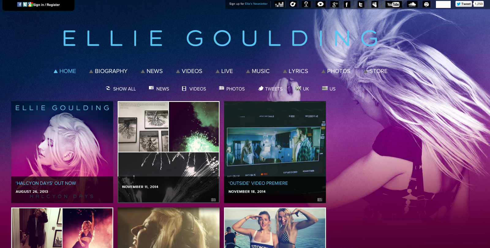
As part of our work towards the Website and Digi - Pack we have chosen to create a banner so we can keep a common theme through out our website and digi pack. To get an idea on how a website banner is created we looked at existing artists and how their website looks and what they've included to their banner. The artists websites we've already looked at are:
Rihanna:

Lana Del Ray

Ellie Goulding
 After looking at their different banners we've decided to include the artists name as it will remind draw attention to it being in bold letters, we will also include things such as, twitter links and other social networking sites. We will also include things like gallery where images will be uploaded of photo shoots and also live performances.


This is a website I looked at to see the different options of sizing for my banner, this was the second one I looked at, this also gave me the size of the banner in miller meters. This one looked more realistic and suitable for the design and banner we was going for.
This is another banner sizing we looked at, looking at this and considering what we wanted to include we through the other sized banner would be more useful.
From the research I gathered I decided to design the banner in Photo Shop as this program allowed me to insert that size I want and would design the same sized banner, I just changed the background and inserted the font we have chosen for out font through the project and promotion of the artist.

This is the size we chose to pick as the size of our banner. We chose this size as it gives us enough room to add links to social networking sites and also it allows us to play with the space we have and won't appear to clogged up.

This is the banner being produced in Photo Shop. I've decided to place Bisola to the left hand side of the banner at that will catch the audience's attention straight away. This also allows space for links to social net working site, but this will all be added when the website is finished.
 This is the final version of the banner. This is similar to what the other artists have on their website.
Audience and artist's feed back:
I asked our audience and artist's feed back:
I asked for the audience and also the artists feedback and they both in total gave the banner a 9/10, their improvement was to make the font bigger, action on this would to make the font bigger so it's more known to the audience and target marker who the artist is.
Rihanna:
Lana Del Ray
Ellie Goulding
This is a website I looked at to see the different options of sizing for my banner, this was the second one I looked at, this also gave me the size of the banner in miller meters. This one looked more realistic and suitable for the design and banner we was going for.
This is another banner sizing we looked at, looking at this and considering what we wanted to include we through the other sized banner would be more useful.
From the research I gathered I decided to design the banner in Photo Shop as this program allowed me to insert that size I want and would design the same sized banner, I just changed the background and inserted the font we have chosen for out font through the project and promotion of the artist.
This is the size we chose to pick as the size of our banner. We chose this size as it gives us enough room to add links to social networking sites and also it allows us to play with the space we have and won't appear to clogged up.
This is the banner being produced in Photo Shop. I've decided to place Bisola to the left hand side of the banner at that will catch the audience's attention straight away. This also allows space for links to social net working site, but this will all be added when the website is finished.
Audience and artist's feed back:
I asked our audience and artist's feed back:
I asked for the audience and also the artists feedback and they both in total gave the banner a 9/10, their improvement was to make the font bigger, action on this would to make the font bigger so it's more known to the audience and target marker who the artist is.
Digi-pak Template and experimentation
Here below is a screenshot of the digi-pak I have created, this shows how well the font works on the digi-pak I have chosen. This digi-pak uses images our artist has provided for us to use, but we will be using images we have taken from our photoshoot.


As were getting inspiration from these artists, these are screenshots of their website.
Looking at Different Fonts
Here I have looked at different fonts using a website called DaFont to find a suitable font which we can use throughout our website, digi-pak and music video. This font will be used throughout all our work being produced, this helps create an image for our artist and makes all of our work we will produce look the same, as they will have the same font and theme.
The first font I looked at was Lemon/Milk, below is an example.

This font at first looked suitable for our artist. But after experimenting and using this font on our digi-pak template it looked out of place. This is because the font is too bold and the style is too wide, we require a font that is less bold and basic.
The next font I looked at was summon of the Executioner, below is an example.

This font I downloaded was unsuitable for our digi-pak, this is because the style of font is more rugged and looks almost rundown. The font above looks scratched and doesn't suit our artists genre. This would be more suited to a rock or electronic genre as it is more rugged and tough.
This font is the last font I looked at, this is the font Steelfish. Below is an example.

This is the final font I looked at. This font is basic but looks very modern and professional, after experimenting with the temporary digi-pak I font that this font worked the best and looked the most relevant to the digi-pak. This font is delicate yet still bold which gives a bold and professional finish to the digi-pak. I also chose this font to use as it is clear to read and is not simple like a basic font.
Here is the temporary digi-pak with pictures of our artist. These images will be replaced with our own images we have taken from our photoshoot. I have used this font throughout the digi-pak in the title and the song listings.
The first font I looked at was Lemon/Milk, below is an example.
This font at first looked suitable for our artist. But after experimenting and using this font on our digi-pak template it looked out of place. This is because the font is too bold and the style is too wide, we require a font that is less bold and basic.
The next font I looked at was summon of the Executioner, below is an example.
This font I downloaded was unsuitable for our digi-pak, this is because the style of font is more rugged and looks almost rundown. The font above looks scratched and doesn't suit our artists genre. This would be more suited to a rock or electronic genre as it is more rugged and tough.
This font is the last font I looked at, this is the font Steelfish. Below is an example.
This is the final font I looked at. This font is basic but looks very modern and professional, after experimenting with the temporary digi-pak I font that this font worked the best and looked the most relevant to the digi-pak. This font is delicate yet still bold which gives a bold and professional finish to the digi-pak. I also chose this font to use as it is clear to read and is not simple like a basic font.
Here is the temporary digi-pak with pictures of our artist. These images will be replaced with our own images we have taken from our photoshoot. I have used this font throughout the digi-pak in the title and the song listings.
Subscribe to:
Posts (Atom)